Note: this work was originally begun for the LPW members’ Antiphony exhibition but abandoned when I signed up to do the DMU Foundation in Art and Design course. I’ll come back to this work at some stage.
Before I start working on images for the Antiphony project, I wanted to test out ways of mark making and colour blending and figure out some way of planning an image in Photoshop. I decided to try to emulate the marks and colours in an existing Ribeiro townscape.
The two townscape paintings I’d been looking at each had features that I liked:


viz, the townscape itself in the first painting and the sky in the second. So I imported both into Photoshop and blended them, not in any careful way but enough to give me a start. Since I had several steel plates, 20cm x 20cm, I also cropped the image to a square format:
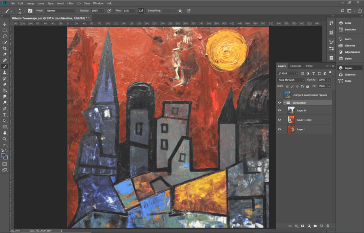
And, much as I loved the red sky, I didn’t think it worked with the townscape, so replaced the red tones with blue:

Next I need to figure out how to plan the marks I’ll be making on the etching plates. I’m assuming I need four plates for the image: a brown/grey base layer to shade colours added later, one each for red/green and yellow/blue colours and a final one for a black key plate to add the building outlines. Or, that’s the plan for now!
