I enrolled to take part in the Artquest Painting Salon last year. There were to be three sessions held via Zoom, at each of which two artists would submit work for critique. I had two of my Faces (previously referred to as the Selves project) paintings looked at in the third crit, on 16th March 2023:

In this post, I’ll record some of the feedback I received and then reflect on it.
The crit was facilitated by Charlotte Warne Thomas of the Peer Sessions group (Kate Pickering led the second artist’s crit) using their silent crit model, whereby:
the presenting artist initially provides relevant practical details (title, media, context) about their work, and then remains silent while they listen to the feedback generated during the discussion. This gives the opportunity to hear unmediated and honest reactions to the art, and build a nuanced and dynamic collective response.
accessed from http://www.peersessions.co.uk/about on 25-Mar-2023.
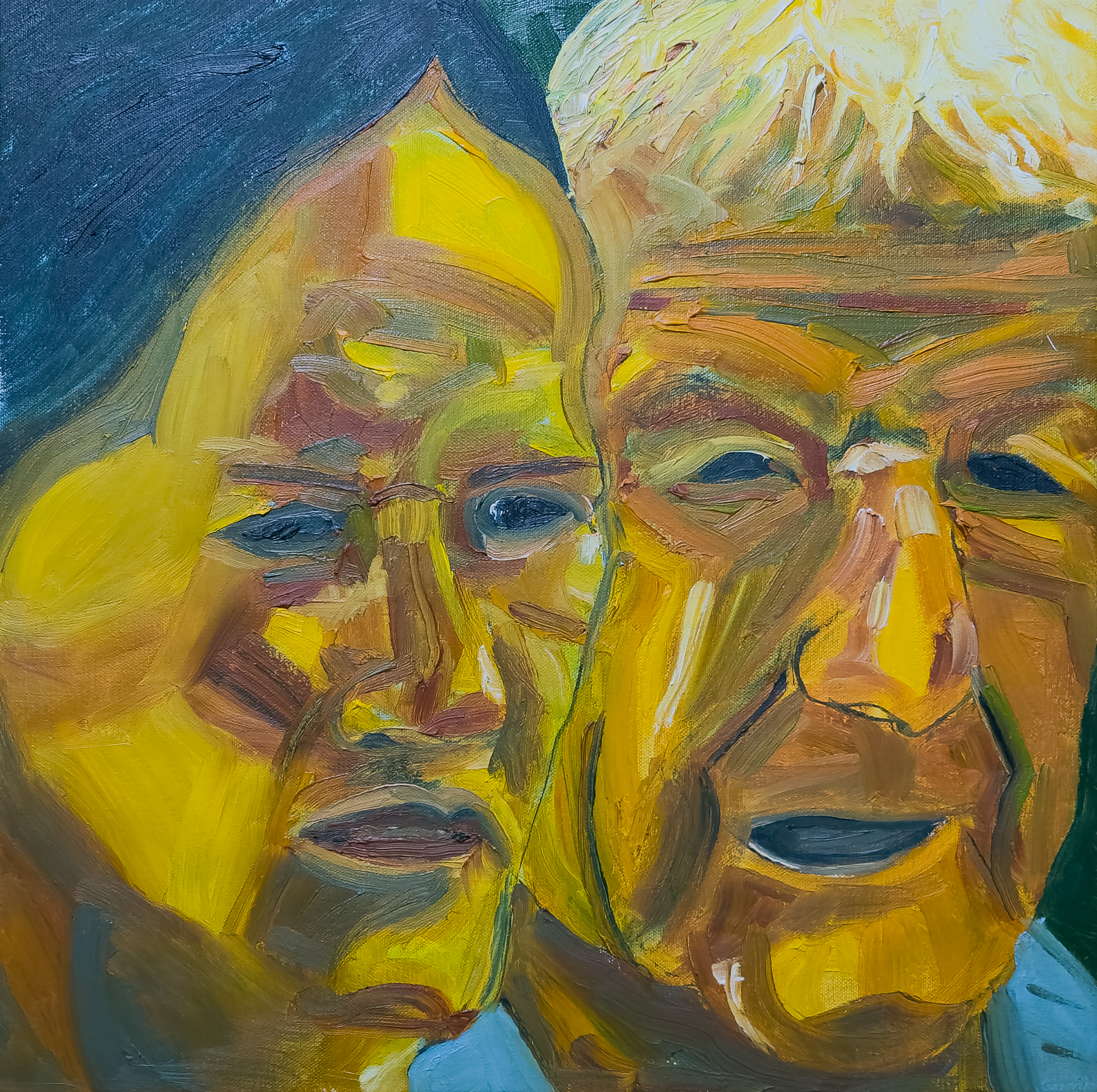
Faces VI
As what I believed to be the more complete work, I asked for the second painting submitted to be discussed first. It certainly generated a wealth of discussion, both the subjects and reading of their narrative, as well as the brushwork and colours employed. I won’t list all the comments but try to pull out the points that were made, either in summary or as quotes from the transcription1. Some of the points are contradictory as people see or interpret different things.
- sense of ageing in both faces
- strong complementary colours
- perhaps denoting a complementary relationship between the two people
- strong light
- harsh yellow lines
- close relationship
- but a sense of tension between them
- faces are like heat maps or masks
- empty inside (blank eyes and mouths)
- they seem like silent witnesses, observing
- but in a detached and disdainful way
- expressionistic yellow, lively
- looking at a photograph of a split moment
- male face is especially mask-like
- female has rubbery side of her face, up into her hairline
- squinty eyes –> bright sunlight
- furrowed brows –> shocked by what they see
- capturing a moment before acting
- female as intelligent & earnest; male as thuggish
- both watching something passively
- face on left has incredible yellow patches & umber-ish lightning strike
- forms & lines creating the face
- drawn to green line that separates the faces
- relationship ambiguous, in both narrative & spatial terms
- flattened perspective
- sense of landscape from earth tones in faces (Australian landscape?)
- mask-like (as in Demoiselles D’Avignon)
- from faces sculpted by large brush marks
- startling yellow, associated with drama & toxicity
- sense of familiarity with people, everydayness
- paradox with alarm associated with the colours, especially yellow
- faces carved from paint; expressive mark making
- almost abstract as if it might morph into a landscape
- perhaps adult daughter with father
- in a moment of friction between them
- focal point is on her/his adjacent eyes
- as if a photograph, press picture
- in a very still moment
This is a very short abstract from 40 minutes of discussion with contributions from eleven people. As in the crit session, I will leave my own comments until after the discussion of the second painting.
Faces I
- more 1920s/30s German expressionist feel to this one
- theatrical, like stage makeup
- roguish faces
- strange use of yellow again
- sweet moment, eg between father and son
- guy on the left is the protagonist,
- the one on the right, an elder figure
- bit of camp
- capturing a brief moment
- with life’s worth of facial expression
- an accumulation of experience
- more general focus than previous painting
- but similar colours used, similar handling
- seemingly random shapes create the faces
- the way the chin of the older figure blends into the other’s neck
- also a mask-like quality to the faces
- but can see the real faces behind as eyes are more delineated
- narrative: person on left more in control
- person on right more vulnerable
- power dynamic between the two
- seeing Die Brücke in the left hand figure
- look like two faces you might see at the average private view
- eg practising artists chatting together
- intrigued and repelled by the greyness on the right hand side
- doesn’t resolve, nor does the chin
- wish the background wasn’t monochromic
- this painting seems more about the process of putting oil on canvas
- and the choice of palette
- stronger than the one above
Chat
Questions from the chat box alongside the discussion, with my answers:
- what makes you choose the size, 46 x 46 cm?
- I like the square format as it carries less baggage than portrait and landscape (as is obvious from the names) – it also suited the two-face composition giving the opportunity to really focus on them.
- did you have any relationship to the people in the photos?
- no, they were just people I photographed some years ago on Loughborough Market: the people in Faces I were two men, walking around together; those in Faces VI were two separate people, shopping on their own.
- do you see people as the same yellows as you have painted them here?
(after I had said in my response that I see people’s faces as yellow)- not exactly: when I paint people, well Caucasian people, I paint them from a yellow base as that best expresses the face I want to create but I suppose I really see whatever colours are actually in the face. I am not good with faces: I don’t recognise them very well or can describe them well after seeing them, so maybe that is why I am not bothered about exactly reproducing the life or photographic colours in the face. To me, the faces look natural, if heightened & expressionistic: not a realistic rendering of the photographs, but representative of the characters I created in my head as I painted.
Notes
These are notes I made while reading through the transcript of the crit:
- the arrangement of the faces was all about getting a composition (of features, forms and lines) in the overlap of the two faces that I could work with. In all the paintings in the Faces series, I extracted each face into a new square Photoshop document then worked on them – flipped and stretched them, moved them, tried different overlaps – to get just the right composition. This was printed and used as the template for the painting.
- Light and shadow in the faces was translated into different colours or combinations of colours
- after listening to all the participants’ comments, I realised that the viewers overall will ‘read’ every detail of a painting so it is not acceptable to make a painting which is just ‘good enough’: it should be the best painting that I can make of that subject at that time.
- in this series, I was definitely more focussed on brushwork than on narrative: I might have invented a small story about the relationship between the two people being depicted and tried to incorporate that into the painting but the mode of expressing that story and the relationship was about colour and brushwork.
- as one of the participants stated, it was about showing ‘an accumulation of experience’ in each face and the intent was to accumulate that experience in the two faces together by parallel placement of colours and marks.
- one participant did not like the monochrome backgrounds in the paintings but this was intentional: I wanted the focus to be wholly on the faces and so made the faces fill the frame and only use a single colour to bracket the faces.
Reflections
I’ll deal with these in the next post.
Footnotes
1. I recorded (on my phone) the conversation about my work and uploaded that to the web version of MS Word at Office 365 using the Dictate/Transcribe menu option:

It does a great job of identifying different speakers and getting what they say, but, in a crit especially, there are lots of umms, errs and pauses which means a lot of editing afterwards if you want to save it.
